

Branding update
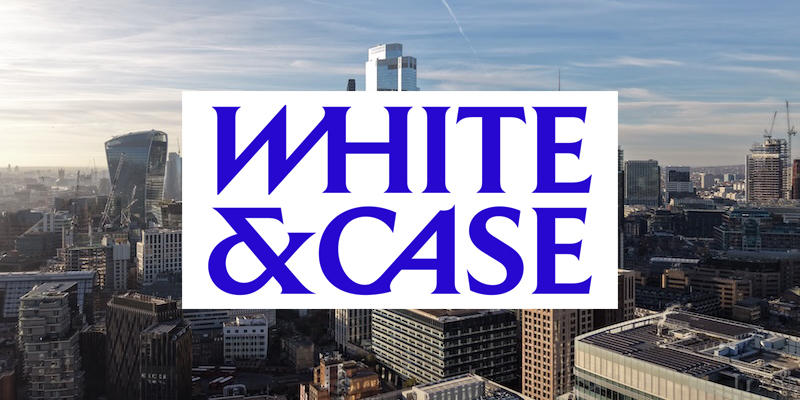
White & Case has unveiled a distinctive new brand identity, giving the global law firm a bold new look.
Announcing the makeover, White & Case said its new identity reflects “who we are and how we work”, adding that it is “energised, forward-looking and focused on helping clients address their biggest challenges with confidence”.
Complexity also sits at the heart of the new branding, with the firm saying: “For White & Case, complexity is not a hurdle. It is where we find our edge.”
The makeover marks a noticeable shift from White & Case’s previous branding, replacing its lighter blue background and plain block capitals with a darker palette and a more stylised wordmark.
White & Case traces its roots back to 1901, when it opened its first office in New York. The US firm later expanded across the Atlantic, establishing its London office in 1971 as it looked to capitalise on the growing Eurodollar market.
The Legal Cheek Firms Most List shows White & Case offers up to 50 training contracts, with future trainees recruited through both its vacation scheme and direct training contract applications. Trainees currently earn £62,000 in their first year, rising to £67,000 in the second, while newly qualified associates take home £175,000.


Looks like a logo for toothpaste
Imagine having one of the cleanest logos in BigLaw and paying someone to make it look like the opening credits of a 1983 divorce drama.
The W looks like it was halfway through a restructuring when the financing collapsed.
White & Case had spent 125 years building prestige, global recognition and one of the cleanest identities in BigLaw. Then somebody asked the question no one needed answered: “What if we looked like a regional casino in 1984?
As someone safely observing from K&E, I can only thank White & Case for reminding the rest of BigLaw that sometimes the best rebrand is leaving the bloody logo alone.
Wow this is so ugly
Horrendous. Looks like a local fish and chips.
As someone safely observing from K&E, I can only thank White & Case for reminding the rest of BigLaw that sometimes the best rebrand is leaving the bloody logo alone.
Legal Cheek unveils bold new identity: Legal Bleak
Legal Cheek has unveiled a distinctive new brand identity, giving the legal news site a bold new look.
Announcing the makeover, the publication said its new identity, Legal Bleak, reflects “who we are and how we work”, adding that it is “energised, forward-looking and focused on helping clients address their biggest press releases with no questions asked”.
Joylessness also sits at the heart of the new branding, with the site saying: “For Legal Bleak, a story is not a hurdle. It is something we have learned to live without.”
The makeover marks a noticeable shift from Legal Cheek’s previous branding, replacing its cheeky tone with a darker palette, a more stylised wordmark and a lingering sense that nothing will ever be interesting again. The Cheek was retired after an internal review found it to be generating jokes.
Legal Bleak traces its roots back to a time when it covered actual news. It later expanded into the growing market for articles about fonts and palettes.
Under the new identity, readers can expect stories on firms changing their logo, firms changing their logo back, and firms announcing that complexity is where they find their edge, each followed by the trainee salary figures in case anyone forgot why they’re here.
AI slop
The White Castle logo is strikingly similar hahaha
I thought it was White Castle for a moment there..
Absolutely electric.
I had to sit down after seeing the new wordmark. Some of those letters are now leaning, and frankly I don’t think the legal profession is ready.
I’ve been looking for my edge in complexity for years but haven’t yet found it, let alone have the courage to put it on a darker shade of blue.
Huge credit to whoever broke this story. Without fearless reporting like this, I’d never have known that a firm founded in 1901 opened a London office in 1971 to capitalise on the Eurodollar market. I’ve printed it out and stuck it on my fridge.
Already counting down to the follow-up piece when they change the kerning.
Will the trainee salaries still be £62k?
Love the new look. The italics really bring a sense of energy, and the darker blue feels much more forward-looking.
I’ve always considered complexity less a challenge and more a home, a place where I can bring my whole self and find my edge.
Can’t wait to see what they do with the kerning.
As someone who’s worked in brand strategy for over a decade, I have to say this is a masterclass. Moving from plain capitals to a stylised wordmark is a brave decision, and the shift to a darker palette signals real maturity. You can feel the 125 years of heritage in every letter, especially the ones that lean. Rebrands like this don’t happen by accident. I imagine there were months of workshops behind those italics, and it shows.
It’s certainly a look.
Can’t lie, I got a bit emotional reading this. The lighter blue was there for me all through my LLB and the SQE, and I’d sort of assumed it always would be. I know change is good and the new look is very forward-looking, but part of me will always miss those plain block capitals. Lit a candle this evening. Wishing the firm all the best on the next chapter.
I’d like to sincerely apologise for my earlier comments, which appear to have been removed. I failed to treat this article with the respect it deserves.
In my defence, I didn’t realise it was hard-hitting journalism.
I mistook it for a press release with some trainee salaries attached, and I can see now that this was unfair.
If I’ve caused any upset to whoever may or may not be footing the bill for this coverage, I can only apologise.
I look forward to the follow-up investigation into their new letterhead.
WHITE and Case???
But exclusive, non?